


So, you’ve done the hard work. You’ve curated an incredible collection, your product photos are stunning, and customers are happily adding items to their carts. But then… poof. They disappear right before hitting that final “buy” button.
It’s a frustratingly common problem, but it’s not just a quirk of selling online. It's a massive, flashing warning sign pointing to a leak in your revenue pipeline. To stop the bleed, you have to get to the root of why they’re leaving.
Finding the Friction in Your Funnel
Every abandoned cart tells a story. It's a customer signaling that something in those final, critical moments created friction, doubt, or just plain annoyance. Was it the sticker shock of an unexpected shipping fee? The hassle of a clunky mobile checkout? Or maybe just that tiny flicker of uncertainty about the fit of that perfect dress?
Generic stats are a starting point, but your real answers are hiding in your own data.
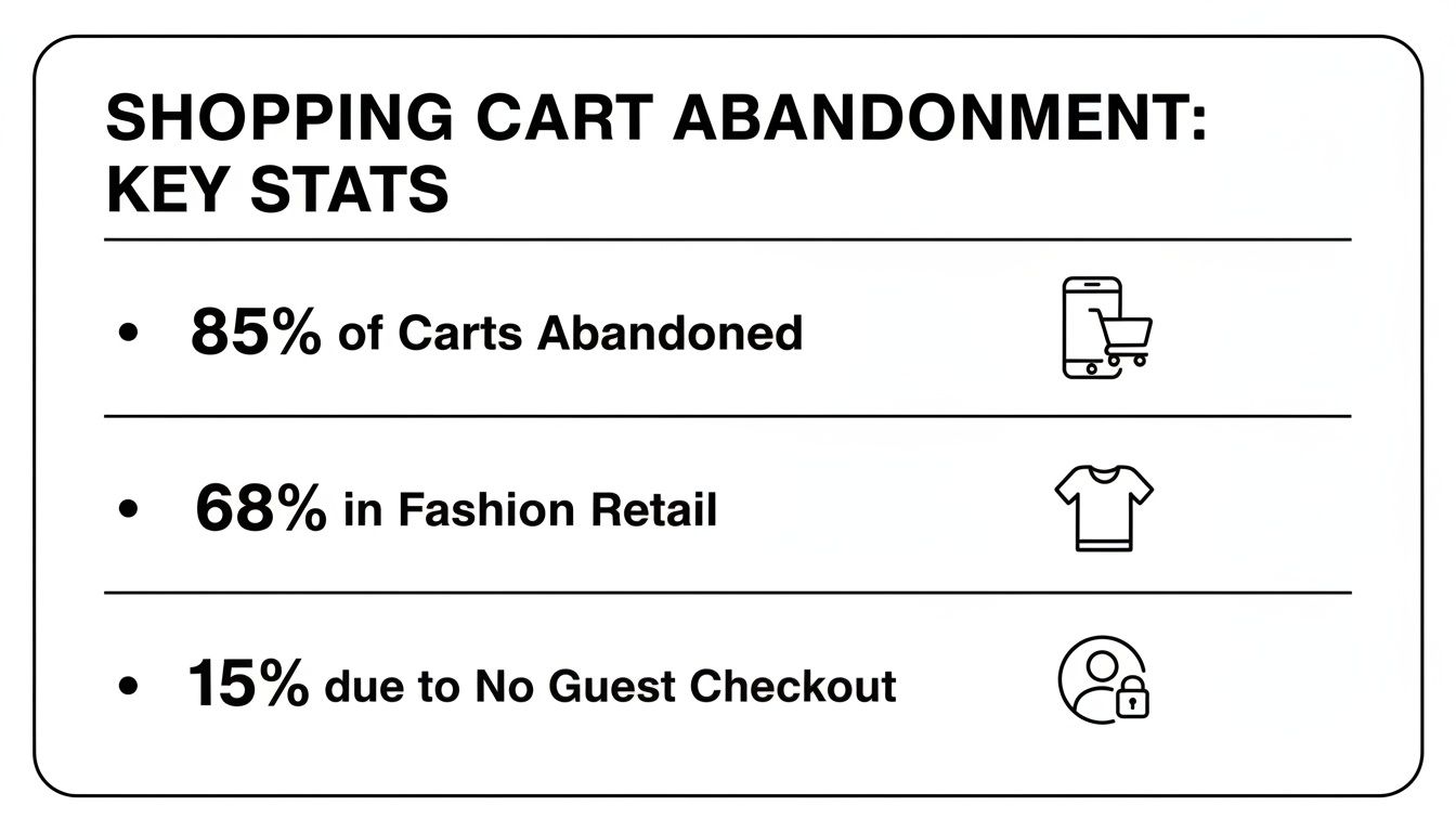
The numbers don't lie. Fashion, in particular, gets hit hard with a global cart abandonment rate of 68.3%. And when you look at mobile shoppers, it skyrockets to an eye-watering 85.65%—a huge deal since phones drive the majority of traffic these days.
Another classic mistake? Forcing people to create an account. A solid 15.24% of shoppers will walk away if you don't offer a guest checkout option. These aren't just numbers; they are clear indicators of customer frustration. For a deeper look, here are 7 proven strategies to reduce cart abandonment that tackle these very issues.
The real issue isn't a lack of interest in your products. It’s a breakdown in trust or convenience during the checkout process. Every extra form field, unexpected cost, and confusing click gives your customer another reason to leave.
Turning Clues into Actionable Fixes
Once you start looking, the clues are everywhere. If your analytics show a mass exodus on the shipping page, you've got a clear signal that your delivery costs are a problem. Seeing a high abandonment rate on items that require precise sizing? Your customers probably lack the confidence to make the purchase without trying it on. (Our guide on how to shop for clothes online with confidence is a great resource to share with them for this very reason!)
Before we jump into the big strategic overhauls, let's identify some of the most common culprits and the quick wins you can implement right now.
Top Reasons for Cart Abandonment and Their Quick Fixes
This table breaks down the most frequent offenders I see holding brands back, along with simple, immediate fixes you can put in place. Think of it as your diagnostic checklist.
| Reason for Abandonment | Impact on Customers | Your Quick-Win Solution |
|---|---|---|
| Unexpected Costs (Shipping, Taxes, Fees) | Creates "sticker shock" and breaks trust. Shoppers feel ambushed at the last second. | Display a shipping calculator or estimated total directly in the cart. Offer a free shipping threshold. |
| Forced Account Creation | Feels like a barrier and a chore. Customers want a fast, frictionless experience. | Implement a prominent Guest Checkout option. Allow account creation after the purchase is complete. |
| Long or Confusing Checkout Process | Overwhelms and frustrates shoppers, especially on mobile. Too many steps kill momentum. | Reduce the number of form fields. Use a progress bar to show how close they are to completion. |
| Concerns About Payment Security | Lack of trust seals or familiar payment logos makes shoppers hesitant to enter their card info. | Display trust badges (SSL certificates, McAfee, Norton) and logos of accepted payments (Visa, PayPal, Apple Pay). |
| Better Price Found Elsewhere | Shoppers are savvy and will quickly comparison shop if they feel the price isn't right. | Implement a price-match guarantee or offer a small, one-time discount for first-time buyers who start to exit. |
| Website Performance Issues (Slow Load Times, Errors) | A slow or buggy site feels unprofessional and untrustworthy, leading to immediate abandonment. | Optimize your site speed, especially the checkout pages. Test your checkout flow regularly for any bugs. |
Remember, cart abandonment isn't the disease—it's a symptom. The cure lies in creating a checkout experience that is as seamless, transparent, and beautiful as the rest of your brand.
Design a Frictionless Checkout Experience
Let's talk about the grand finale of your customer's shopping trip: the checkout.
They've browsed, fallen in love with the perfect outfit, and added it to their cart. This is the moment that seals the deal. Is your checkout a clear, welcoming red carpet, or is it a frustrating maze of forms that makes them wonder if it's even worth it?
This isn't just about making things look pretty; it's about respecting your customer's time and excitement. A clunky checkout is a notorious deal-breaker. In fact, research shows a staggering 22% of shoppers bail on their cart simply because the process is too long or confusing.
We're going to build a checkout experience that feels like a victory lap, not an obstacle course. The goal is to get rid of every single point of friction—every unnecessary click, every confusing field, every moment of hesitation that gives them a chance to walk away.
Simplify the Path to Purchase
The fastest way to lose a sale is to make someone work for it. Today's shoppers, especially on mobile, expect speed and simplicity. Your checkout should feel like a quick, friendly conversation, not an interrogation.
A fantastic place to start? Offer a prominent guest checkout option. Seriously, forcing someone to create an account is one of the biggest conversion killers out there. More than a quarter of shoppers will ditch a cart if you make them sign up first. Let them buy what they want, and then on the confirmation page, give them a simple, one-click option to save their details for next time.
Next, take a hard look at your forms. Do you really need their phone number? Do you need a separate billing address field if it's the same as their shipping? Cut the fluff. Combine steps where you can and use tools like address auto-fill to do the heavy lifting for them.
The ultimate checkout experience is one the customer barely remembers. It should be so smooth and intuitive that their focus stays on the excitement of their new purchase, not on the process of paying for it.
Manage Expectations and Build Trust
Uncertainty is the enemy of a completed sale. Customers need to feel like they're in control and know what's happening every step of the way.
One of the most powerful and simple tools for this is a visual progress bar. Showing them clear steps like "Shipping > Payment > Review" tells them exactly where they are and how close they are to the finish line. It completely removes the anxiety of a seemingly endless checkout.
Beyond that, you have to actively build trust, especially when it's time to pull out the credit card. Last-minute security jitters can stop a sale dead in its tracks. This is where trust signals become your best friend.
- Flash Those Security Badges: Make sure you're prominently displaying logos from trusted names like McAfee, Norton, or your SSL provider. These are instant visual cues that tell customers their data is locked down.
- Show Off Your Payment Partners: Displaying the logos for Visa, PayPal, Apple Pay, and others does more than just show flexibility. It borrows the trust customers already have in those massive brands.
- Keep Your Policies in Plain Sight: A simple link to your return policy right in the checkout can dissolve any final hesitation. Knowing they have an easy out if something isn't right gives them the confidence to click "Buy Now."
By weaving these signals into your checkout, you’re not just processing a payment; you're creating a secure space. For more on this, our guide on how to shop online safely is a great resource to even share with your customers.
Optimize for a Seamless Mobile Checkout
With well over half of all e-commerce traffic now coming from smartphones, a clunky mobile checkout isn't just an inconvenience—it's a critical failure. What looks fine on a desktop can feel like a nightmare on a small screen.
Think about the actual experience of typing on a phone. Long forms are a pain, and tiny buttons are infuriatingly easy to miss. Optimize your mobile checkout with bigger form fields, clear, thumb-friendly CTA buttons, and a design that never requires someone to pinch and zoom.
The real game-changer for mobile, though, is integrating digital wallets. Options like Shop Pay, Apple Pay, and Google Pay can obliterate cart abandonment by letting customers pay with a single tap or fingerprint. This bypasses all the manual data entry. Some studies even show these one-click checkouts can boost conversion by up to 50% compared to a standard guest checkout.
When you make it this easy to buy, you effortlessly turn excited browsers into happy, loyal customers.
Eliminate Surprise Costs and Shipping Shock
Let’s be real for a second. Nothing kills the buzz of a great find faster than that gut-punch at checkout. You’ve found the perfect dress, you’re daydreaming about wearing it, and then BAM—the total price skyrockets with shipping fees and taxes you never saw coming.
This isn't just an annoyance; it's the number one reason people ditch their carts. A staggering 48% of shoppers walk away precisely because of these last-minute extra costs.
It’s more than just the money, though. It’s about trust. When you aren't upfront about the final price, customers feel tricked. That feeling is powerful enough to make them abandon items they genuinely wanted. The good news? You can completely sidestep this by making transparency your best friend.
Be Radically Transparent with Pricing
The most powerful way to fix shipping shock is to make sure it never happens in the first place. You want to give your customers a crystal-clear picture of their total cost as early as humanly possible. Hiding fees until the final click is a surefire way to lose a sale.
So, bring that information forward. A brilliant move is to add a shipping calculator right on the cart page. Let shoppers pop in their zip code or country and see the shipping estimates instantly. This simple act of honesty builds immediate trust and sets expectations right from the start. No surprises, no drama.
The moment a customer adds an item to their cart, they're doing the mental math. Show them the all-in cost upfront. It respects their time and removes the single biggest reason they might leave.
Turn Shipping Costs into a Strategic Advantage
Shipping might be a logistical headache for you, but it doesn't have to be a deal-breaker for your customers. With a bit of smart positioning, you can actually use shipping to get people to spend more.
One of the most effective tactics in the book is offering free shipping over a certain amount. Think "Free Shipping on All Orders Over $75!" This works like a charm for a few reasons:
- It bumps up your average order value (AOV). Someone with $65 in their cart is incredibly likely to add another top or accessory to hit that free shipping mark.
- It makes the decision easier. It flips a negative (paying for shipping) into a positive (earning a reward).
- It just plain converts. "Free" is one of the most powerful words in marketing. It can be the final nudge a hesitant buyer needs.
The trick is to set your threshold just right. Take a look at your current AOV and set the free shipping bar about 15-20% higher. This sweet spot encourages people to add more to their cart without the goal feeling out of reach.
Communicating International Shipping Clearly
For a global brand like Arrisco, this is non-negotiable. International shoppers are extra sensitive to shipping costs and delivery times, so you have to be exceptionally clear.
Don't just have a vague "International Shipping" option. Break it down. Show different costs and delivery estimates for different regions or countries. Clearly laying out the difference between standard and express international shipping—both in cost and time—empowers customers to choose what works for them. Our guide on securing Korean fashion with international shipping is packed with great examples of how to nail this communication for a global audience.
When you tackle surprise costs head-on, you're doing more than just lowering your cart abandonment rate. You're building a foundation of trust that creates loyal, repeat customers who know you'll always give it to them straight.
Build Rock-Solid Buyer Confidence with Fit Tech and Social Proof
Let's be real. When you're selling fashion online, you're not just selling a garment; you’re selling a feeling. And the biggest hurdle between your customer and that feeling is one little question that screams doubt: “But will it actually fit me?”
This single uncertainty is a monster driver of abandoned carts in fashion. The good news? It's a problem you can solve long before they even glance at the checkout button. The key is to build unshakeable confidence right there on the product page, answering every fit-related question and squashing every doubt with a one-two punch of smart technology and authentic social proof.
Let Technology Solve the Sizing Puzzle
Guesswork is the absolute enemy of conversions. Nobody wants the headache of a return, so instead of taking a gamble, many shoppers just bail. This is where modern fit technology becomes your secret weapon.
Instead of just slapping up a static, one-size-fits-all size chart, you need to offer a dynamic, personalized experience that does the heavy lifting for the shopper.
- AI-Powered Size Recommenders: These tools are brilliant. They ask for a few simple details—like height, weight, and maybe the size they wear in a brand they already own—and instantly recommend the perfect size in your clothes. No more guessing games.
- Hyper-Detailed Measurement Charts: Go way beyond "S, M, L." Give them the nitty-gritty: specific garment measurements for the bust, waist, and inseam. Don't forget to include international size conversions to help your global customers feel right at home.
- Virtual Try-On Tools: Imagine your customer seeing how a dress drapes on a model with her exact body type. It's a game-changer. You can learn more about how virtual try-on technology is changing fashion and see how it demolishes last-minute hesitation.
When you give customers these tools, you're doing more than just providing data; you're giving them peace of mind. You’re saying, "Hey, we get it. We've got your back, and we'll help you get this right the first time."
When a shopper trusts your sizing recommendations, that "what if it doesn't fit?" anxiety just melts away. Fit-tech isn't a gimmick; it's a powerful trust signal that directly tackles the biggest friction point in online fashion.
Let Your Customers Do the Selling with Social Proof
Technology is amazing for answering the technical questions, but shoppers also have a more emotional one: “How will this look in the real world, on someone like me?” This is where social proof becomes your superpower. Nothing sells your clothes better than seeing real, happy customers absolutely rocking them.
Authenticity is everything. Your professional studio shots are gorgeous, but user-generated content (UGC) has a raw, relatable energy that staged photos just can't match.
Start by actively encouraging customers to leave reviews with photos. It's a stunning fact that 73% of consumers say photos and videos from other customers make them more confident in their purchase. Don't hide these gems at the bottom of the page—feature them prominently, creating a vibrant gallery of real-world looks.
You can take it a step further by creating dedicated UGC galleries on your site, pulling in tagged photos from Instagram. This not only provides killer social proof but also fosters a genuine community around your brand. To really get the ball rolling, look into strategies like product seeding to build authentic social proof, which is a fantastic way to get your products into the hands of real people who will create that content you crave.
Seriously, when a potential buyer sees someone with a similar body shape or personal style looking incredible in that top she's eyeing, it's the ultimate validation. It gives her that final, confident nudge to click "Add to Cart" without a second thought.
Win Back Lost Sales with Smart Recovery Campaigns
An abandoned cart almost never means "no." Think of it as a "maybe later." Life happens—the dog started barking, a meeting popped up, or they just wanted to sleep on it. This isn't a dead end; it's a golden opportunity to reconnect with someone who's already shown they love what you offer.
The trick is to create automated recovery campaigns that feel less like a hard sell and more like a helpful, on-brand tap on the shoulder. Let's walk through how to win back these almost-customers with a smart combination of email, SMS, and retargeting ads.
Crafting the Perfect Abandoned Cart Email Sequence
A generic "You left something behind!" email just won't cut it. Your recovery emails need to reignite that spark of excitement the shopper felt when they first added that perfect dress to their cart. It all comes down to timing and tone.
Data consistently shows that sending the first recovery email within one hour of abandonment hits the sweet spot. Their interest is still sky-high, and a quick, friendly reminder can work wonders. But why stop there? A well-planned, multi-email sequence can build momentum without being pushy.
Here’s a three-part flow that we’ve seen work time and time again:
- Email 1 (30-60 minutes later): This is the gentle nudge. A subject line like, "Did you forget something?" paired with a gorgeous photo of the item they left behind is perfect. Keep it simple and helpful, with a crystal-clear button to take them right back to their cart.
- Email 2 (24 hours later): Now it's time to add a little more value. This email can subtly remind them what's so great about the product. Maybe you feature a glowing customer review for that specific item or create a little urgency with a line like, "Heads up! Your size is selling fast!"
- Email 3 (3 days later): This is your final, strategic move. If they still haven't come back, a small incentive can be just the push they need. A modest 10% discount or a free shipping code is often enough to seal the deal without making it seem like you're desperate.
Reaching Customers Instantly with SMS Reminders
Email is fantastic, but SMS is immediate. Text messages have ridiculously high open rates, with most being read within just a few minutes. This makes them the perfect tool for a quick, direct follow-up.
Because texting feels so much more personal, you have to get the tone just right. Your messages should be short, conversational, and always give them an easy way to opt out.
Something simple like, "Hey! Looks like you left some must-have pieces in your Arrisco cart. Your styles are saved and waiting for you here: [link]" feels like a note from a friend, not a corporation.
Your recovery campaigns should always feel like a natural extension of your brand's voice. Whether it's an email or a text, the goal is to be a friendly concierge, not an aggressive salesperson.
Staying Top-of-Mind with Retargeting Ads
Ever look at a pair of shoes online, only to see them magically appear in your Instagram feed a few hours later? That’s retargeting, and it’s an absolute game-changer for bringing shoppers back.
By running retargeting ads on platforms like Facebook and Instagram, you can serve up dynamic ads that feature the exact products from their abandoned cart. It’s a powerful visual reminder of what they were just about to buy. For a deeper look into creating ads that truly connect, exploring different fashion marketing techniques for success is a great next step.
When a shopper sees that dress they were on the fence about pop up in their social feed, it makes returning to your store feel completely natural. You aren't just crossing your fingers and hoping they remember you—you're strategically putting your brand right back in their path, making it incredibly easy for them to come back and finish what they started.
Turn Your Analytics into Actionable Insights
Let's be real: you can’t fix a leak you can't see. All the design tweaks and recovery emails in the world won’t move the needle if you're not targeting the actual problems. This is where your data stops being a bunch of boring spreadsheets and becomes your secret weapon for skyrocketing conversions.
Think of your analytics dashboard as a treasure map leading straight to more sales. The goal isn't just to hoard data; it's to use that data to find the exact spots where shoppers are getting stuck and bailing. This takes the guesswork out of the equation, so you can stop treating symptoms and start curing the root causes of abandonment.
Pinpoint Your Funnel’s Weakest Links
Your first mission is to put on your detective hat. Using a tool like Google Analytics, you can build a checkout funnel visualization. This gives you a crystal-clear, step-by-step map of your checkout process and, most importantly, reveals the precise pages where your customers are vanishing into thin air.
Seeing a massive drop-off right after the shipping page? That’s a huge red flag that your shipping costs are scaring people away. Is the payment page bleeding customers? Maybe your payment options are too restrictive, or the page just doesn't feel secure enough.
A checkout funnel report is your single source of truth. It doesn't guess; it tells you exactly where the friction is. Focus your energy on fixing the biggest leaks first for the greatest impact.
Embrace the Power of A/B Testing
Okay, so you've found a problem area. Now what? How do you know which solution will actually work? You test it! A/B testing, or split testing, is how you make smart, profitable decisions instead of just hoping for the best.
It's a pretty simple idea: you create two versions of a page (let's call them 'A' and 'B') with one specific difference, then show each version to a different group of visitors.
For instance:
- Test A: Your current checkout page.
- Test B: The same page, but with a bold, green call-to-action button instead of a grey one.
From there, you just measure which version gets more people to complete their purchase. You can use this method to experiment with virtually anything—page layouts, headlines, different shipping offers, trust badges, you name it.
Instead of relying on gut feelings, you let your customers’ actions tell you what truly works. This methodical approach ensures your efforts on how to reduce shopping cart abandonment are always based on solid proof, not just assumptions.
Your Top Questions, Answered
When you start digging into the challenge of abandoned carts, a few questions always seem to pop up. Let's tackle some of the most common ones I hear from fashion brands ready to reclaim those lost sales.
What's a Good Shopping Cart Abandonment Rate for Fashion?
Honestly, the industry average for fashion is pretty wild, often hovering somewhere between 68% and 85%. It's a tough crowd! A fantastic first milestone after you start making changes is to push that number below 60%.
The real rockstars in the space, the ones who've dialed everything in, can get their rates down to the 45-50% range. But here's the secret: don't get too fixated on hitting some magic industry number. The real win is consistently beating your own benchmark month after month. That's how you know you're on the right track.
How Soon Should I Send a Cart Abandonment Email?
Timing is everything here, and you want to strike while the iron is hot. That first email needs to go out within one hour of them leaving your site. Their desire to buy is still incredibly high, so a gentle nudge sent 30-60 minutes later works wonders.
My go-to sequence that converts without being pushy:
- Email 1 (1 hour later): A simple, friendly "Did you forget something?" reminder.
- Email 2 (24 hours later): Focus on the product's benefits, maybe hint at scarcity.
- Email 3 (3 days later): If they still haven't bit, this is where you can try a small, compelling offer to seal the deal.
Does Offering Guest Checkout Hurt Customer Signups?
Not at all—in fact, it's quite the opposite. Forcing someone to create an account before they can buy is one of the fastest ways to kill a sale. It's a huge point of friction.
The smartest approach is to make guest checkout the most obvious, easy path to purchase. Get the sale first, always.
Then, on the order confirmation page, you can hit them with a simple, one-click option to create an account using the details they just gave you. Frame it as a benefit for them—mentioning things like easier order tracking or faster checkout next time. You get the sale and the signup. It’s a win-win that puts the customer's experience first.
Ready to transform your checkout experience and capture more sales? The stunning, trend-forward collections at Arrisco are designed to delight customers from first click to final purchase. Discover the difference at the official Arrisco online store.