


Let's face it, getting people to your online store is only half the battle. The real magic happens when you turn those visitors into actual customers. For a fashion brand, this isn't just about transactions; it's about crafting an experience so compelling that casual browsers become loyal advocates who can't wait for your next drop.
The goal is to perfect every single interaction, from the moment they land on your site to the final click at checkout. It's all about building trust and making it ridiculously easy for them to say "yes."
Your Foundation for Higher Conversion Rates
Ready to turn more of those "just looking" visitors into happy, paying customers? Boosting your e-commerce conversion rate is the single most powerful thing you can do for real, sustainable growth. Forget just throwing more money at ads to get more traffic; it’s about making the traffic you already have work harder for you.
For a fashion brand like Arrisco, this means we're moving past generic tips and getting straight to what works for selling apparel online. This guide is your new playbook, packed with strategies that have been proven in the trenches.
We'll start with the basics—getting a clear picture of where you stand right now—and then dive into the high-impact changes that actually move the needle. To get your mind warmed up, here are some great foundational insights into 5 easy ways to improve your conversion rate.
Understanding the Benchmarks
Before you can improve, you need to know what you're up against. It's so important to have a benchmark.
Globally, a "good" conversion rate is somewhere between 2% and 4%. But in the fashion world, we have our own unique hurdles. The industry average is a much tighter 1.9%. Why? A huge part of it is the "will it fit?" dilemma—that moment of hesitation every online clothing shopper feels. This is exactly why resources like a clear international size chart conversion are non-negotiable.
Digging deeper, desktop users convert at an average of 4.8%, but mobile shoppers lag way behind at just 2.9%. That's a massive gap, especially when you realize that a whopping 73% of all e-commerce traffic comes from mobile devices!
Your goal isn't just to hit some arbitrary industry number. It's about achieving real, consistent growth, month after month. Think about it: even a small jump from 1.9% to 2.5% can mean a massive boost in revenue, all without spending a single extra dollar on ads.
Here’s a quick visual that really drives the point home, showing how fashion stacks up against desktop and mobile averages.
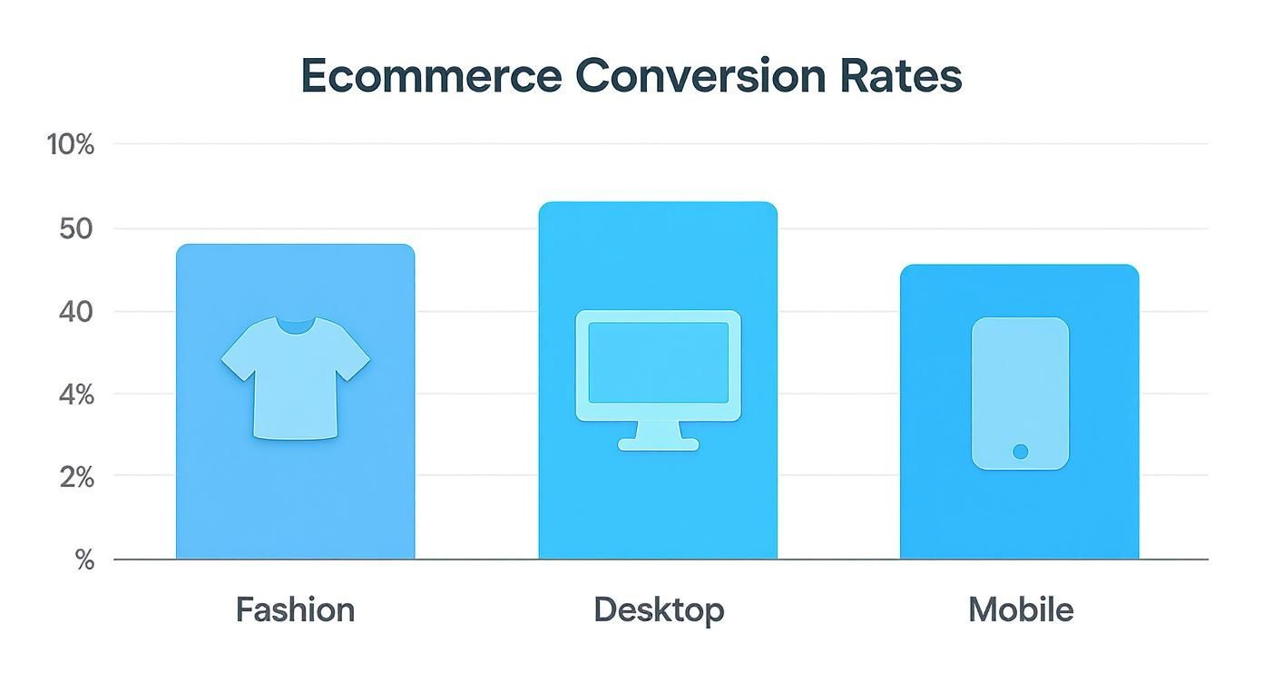
The data tells a clear story. While desktop is holding its own, that lower mobile conversion rate isn't a weakness—it's your single biggest opportunity for growth.
Ecommerce Conversion Rate Benchmarks by Industry
Wondering how your brand stacks up against the wider e-commerce world? Context is everything. See how average conversion rates look across different sectors to get a better sense of your own performance.
| Industry | Average Conversion Rate (%) |
|---|---|
| Arts & Crafts | 4.01% |
| Food & Beverage | 3.59% |
| Health & Beauty | 3.08% |
| Electronics | 2.50% |
| Fashion & Apparel | 1.90% |
| Home & Garden | 1.62% |
Seeing these numbers in black and white really highlights the unique challenges each industry faces. For fashion, it reinforces just how crucial it is to build trust and overcome those sizing and fit anxieties.
2. Master Your Product Presentation
Your product page is your digital storefront, your fitting room, and your most valuable salesperson all rolled into one. This is where a casual visitor decides whether to fall in love with a piece and click “Add to Cart.” To really start improving ecommerce conversion rates, we have to think beyond just listing sizes and materials. It's about telling a visual story that sells not just a garment, but a feeling.
Think about it: shoppers can't touch the fabric or feel the quality of the stitching online. Your job is to bridge that sensory gap with an incredible presentation. We need to create an experience that feels personal, immersive, and builds absolute confidence in their purchase.
Elevate Your Visuals from Good to Unforgettable
High-quality, professional photos are table stakes. Everyone has them. To truly stand out, you need to show your products in a way that helps shoppers see them in their lives.
The goal is a mix of imagery that answers every question before it's asked and sparks that "I have to have it" desire.
- Crisp Studio Shots: Start with clean, perfectly lit photos on a neutral background. Get every angle—front, back, and side. A killer zoom feature is non-negotiable; let them get up close and personal with the fabric texture and every last detail.
- Dynamic Lifestyle Photos: This is where you sell the dream. Show your clothes in motion, out in the real world. A shot of a dress catching the breeze during a city walk is infinitely more powerful than one hanging on a rack. It builds an emotional connection.
- Product Videos & 360-Degree Views: Video is an absolute conversion machine. A quick clip showing how a skirt moves when you walk or how a handbag opens can be the final nudge someone needs. A 360-degree view gives them the next best thing to holding it in their hands.
A jaw-dropping 75% of online shoppers rely on product photos to make their purchase decision. Don’t just show the product; showcase the experience of owning it.
Write Copy That Sells an Emotion
Your product descriptions are your silent salespeople. Don't let them be boring! Generic, feature-heavy copy will put your customers to sleep. You need to focus on the benefits and the feeling your clothing creates.
Instead of just, "100% silk satin top," try something like, "Feel the effortless drape of pure silk satin against your skin, designed for a confidence that glows from brunch to boardroom." See the difference? One is a fact; the other paints a picture.
After you've hooked them with that emotional opening, use short, scannable bullet points for the practical stuff—fit, material, and care instructions.
Build Trust with Authentic Social Proof
Let's be real: shoppers trust other shoppers way more than they trust brands. That makes social proof an essential conversion tool, not just a nice-to-have. It needs to be woven right into your product pages.
Start by displaying customer reviews and star ratings right up top. But then, take it a step further. Actively encourage your customers to upload photos of themselves rocking your pieces. A user-generated content (UGC) gallery on your product pages is pure gold—it shows your clothing on all different body types and builds a real community. Seeing someone who looks like them loving an item is often the final piece of the puzzle for a hesitant buyer.
To truly master your product presentation, it’s worth diving deep into a comprehensive resource; this ultimate guide to product page optimization is a fantastic place to start.
Answering Questions Before They're Even Asked
The single biggest source of anxiety in fashion e-commerce? Fit. If you can solve the "Will this actually look good on me?" question, you've won half the battle.
Proactively addressing this is one of the highest-impact changes you can make. Modern tools are game-changers here. For instance, many brands are seeing huge success with how virtual try-on technology builds confidence for their shoppers. Letting customers visualize how a garment might look on their specific body type does more than just reduce hesitation—it crushes it, leading to fewer returns down the line.
Guiding Shoppers from Discovery to Cart
A smooth shopping journey is a profitable one. It all starts with making it incredibly easy for customers to find exactly what they’re looking for. When shoppers can glide from initial curiosity to the perfect item, you're not just improving their experience; you're paving a direct path to higher conversion rates. Think of it as clearing a VIP lane from your homepage straight to the fitting room.
The second someone lands on your site, they're on a quest. If that quest feels like a fun treasure hunt, you’ve won. If it’s more like a maze with dead ends, they'll bounce. The trick is to lower their cognitive load—make the next click so obvious they don't even have to think about it.
Supercharge Your Site Search
Your search bar is one of the most powerful conversion tools on your entire website, period. Shoppers who use it are often your most qualified visitors. They have high intent—they know what they want and are ready to buy if you can just show it to them. A basic keyword search just doesn’t cut it anymore.
To really nail this, your search function needs to be smart and forgiving. It should understand typos, handle synonyms ("handbag" vs. "purse"), and process long-tail queries like "black vegan leather crossbody bag" without a problem.
Let's take it a step further. Imagine a potential customer screenshots an influencer wearing a gorgeous floral dress on Instagram. They pop over to your site and upload it to your visual search tool. Instantly, your site serves up three similar floral dresses from Arrisco's latest collection. You’ve just turned a "maybe" into an almost certain sale.
Make Navigation and Filtering Intuitive
Beyond the search bar, your site’s navigation menu and filtering options are the roadmaps that guide every shopper. A cluttered or confusing menu is an instant conversion killer. The best navigation feels instinctual, almost like the site is reading the customer's mind.
Keep your main navigation clean, focusing only on your most critical categories. For a brand like Arrisco, this means clear, simple headings like "Dresses," "Tops," "Bags," and "New Arrivals." Don't overwhelm them with a dozen choices right off the bat.
According to Information Foraging Theory, shoppers are trying to get the most valuable info with the least amount of effort. If your filtering system is a pain to use, you're making them work too hard, and they'll simply "forage" somewhere else.
Once they click into a category, filtering becomes their best friend. Giving shoppers robust filtering options can dramatically boost their confidence and speed up their journey to the cart.
For a fashion store, these are absolute must-have filters:
- Size: A clear, easy-to-use filter that perfectly matches your sizing chart.
- Color: Use visual swatches, not just text names for colors. It's so much faster.
- Price: A simple slider or predefined ranges are the way to go.
- Style or Fit: Let them narrow things down by "A-Line," "Bodycon," or "Relaxed Fit."
- Occasion: Filters like "Work," "Wedding Guest," or "Casual Weekend" help them shop with a specific goal.
A fantastic user experience here means they can stack multiple filters at once without the page needing to reload every single time. It should feel zippy, responsive, and genuinely helpful. To get inside your customer's head, our guide on how to shop for clothes online has some great insights.
When you remove all that friction in the discovery phase, you’re not just helping them find a product—you're building the momentum that carries them all the way through checkout.
Designing a Frictionless Checkout Experience
This is it—the moment of truth. After all the work you've put into your brand, your products, and your marketing, the customer is finally at the checkout. This is where a curious browser becomes a happy customer, but it's also where a shocking number of sales simply evaporate into thin air. Even the slightest bit of friction here can be enough to make a shopper abandon their cart and click away forever.
The secret to improving ecommerce conversion rates at this critical final stage is to make the entire process feel ridiculously easy, secure, and fast. Your mission is to hunt down and eliminate every single obstacle, every confusing step, and every question that could give a customer a reason to pause. Let's plug those leaks and get more people to cross the finish line.

Ditch Forced Account Creation
If you take only one thing away from this section, let it be this: never, ever force someone to create an account to buy from you. This is one of the biggest, most common, and most easily fixed conversion killers out there. People are busy. A mandatory sign-up feels like a chore, a commitment they're not ready for.
Your best move? Make guest checkout the most obvious, can't-miss-it option on the page. Let them fly through the process. You can always give them a chance to create an account after the sale is complete. A simple "Save your information for next time?" with a single click is a much friendlier approach that respects their time and will instantly cut down on abandoned carts.
Streamline Your Forms for Speed
Think of every single form field as a tiny speed bump. A few are fine, but too many will bring the customer's journey to a grinding halt. The name of the game is to be ruthless and cut your forms down to the absolute bare minimum you need to get the order out the door.
- Embrace Autofill: Make sure your forms are coded to let browsers like Chrome and Safari do the heavy lifting, instantly filling in the customer's name, address, and contact details.
- Use a Single "Full Name" Field: Seriously, stop making people tab between "First Name" and "Last Name." One field is faster, cleaner, and just feels more modern.
- Implement Smart Address Lookups: Tools that suggest and auto-complete addresses as someone types are a game-changer. It’s not just faster; it dramatically cuts down on costly shipping errors from typos.
The Principle of Transparency is all about building trust when there’s uncertainty. Since so much cart abandonment happens during checkout, applying this principle by being clear and simple can make a huge difference in your conversion rates.
Be Upfront About All Costs
Nothing sours a sale faster than a surprise shipping fee popping up at the very last second. I've seen it tank conversion rates time and time again. It feels like a bait-and-switch, and it shatters the trust you've been building.
Show all your cards early. Display shipping costs—or your free shipping threshold—right on the product page or in the cart summary. For a brand like Arrisco, which offers free global shipping over $300, a dynamic little progress bar in the cart works wonders. A simple message like, "You're only $52 away from free shipping!" is brilliant because it not only removes the surprise but actually encourages customers to spend more.
Offer a Modern Payment Suite
You've gotten them this far, don't lose them at the payment step! You need to make paying as thoughtless as possible by offering the options your customers already have saved on their phones and in their browsers. A limited set of choices feels archaic and can force someone to get up and hunt for their wallet—a moment of friction that can easily lead to a lost sale.
Your payment gateway should be a welcoming hub for all types of buyers:
- Digital Wallets: Express checkout options like Apple Pay, Google Pay, and PayPal are no longer a nice-to-have; they're essential. They enable one-click payments, which is the absolute gold standard for mobile shoppers.
- Buy Now, Pay Later (BNPL): For fashion brands, services like Klarna or Afterpay are non-negotiable. They let shoppers split their purchase into smaller, interest-free payments, which makes higher-priced items feel much more attainable and softens the blow of a large cart total.
By obsessing over every detail of your checkout, you’re not just removing friction—you’re building trust and creating a smooth, confident path to purchase. For more ideas on keeping customers happy, have a look at our guide on effective customer care contact methods.
2. Tackle Fit & Returns Head-On to Build Rock-Solid Trust
Let's be honest, for any fashion brand, two huge, invisible questions loom over every potential sale: "Will this actually fit me?" and "What if I hate it and have to send it back?"
These aren't just minor concerns; they are absolute conversion killers. Getting ahead of them isn't just a nice-to-have. It’s one of the most direct ways to boost your conversion rate because you're dismantling a customer's biggest fears before they even have a chance to take root.
When a customer feels confident, they click "Add to Cart." It's that simple. And building that confidence is all about taking the risk out of their decision.
https://www.youtube.com/embed/kLneJKAqRtk
Use Sizing Tech to End the Guesswork
"Fits true to size" just doesn't cut it anymore. Guesswork is the mortal enemy of a confident purchase. Shoppers, especially if they're new to your brand, need real, personalized reassurance that they're picking the right size for their body.
This is where AI-powered sizing tools are complete game-changers. I've seen them work wonders. They go way beyond a static chart by asking for a few simple inputs—like height, weight, and maybe the size they wear in another popular brand. The tool’s algorithm then crunches the numbers and spits out a super-accurate size recommendation for your specific product.
Imagine how this plays out for a brand like Arrisco:
- A shopper is eyeing a new dress but is on the fence about sizing.
- She clicks a "What's My Size?" button, enters her height and weight, and notes she usually wears a size 6 at J.Crew.
- The tool instantly recommends a Medium, showing a 95% confidence score that it'll be a perfect fit.
You've just swapped out a customer's anxiety for data-driven confidence. This is huge. Not only does it nail the initial conversion, but it also has the massive side benefit of slashing your return rates, which is a direct win for your bottom line.
Make Your Returns Policy a Reason to Buy
Stop hiding your returns policy in the footer like it's some boring legal document! A clear, generous, and easy returns policy is one of the most powerful marketing tools you have. It's a safety net that gives shoppers the final permission they need to go ahead and buy.
A friendly returns policy completely erases the risk of buying something online. The message you're sending is loud and clear: "Go for it. Try it on at home. If you don't absolutely love it, we'll make sending it back a breeze." That simple promise is often the final nudge a hesitant shopper needs to take the plunge.
Put Your Policy Front and Center
For your returns policy to do its job, it needs to be seen. You have to shout it from the rooftops at every key moment in the buying journey.
- On Product Pages: Pop a small, reassuring line of text right under the "Add to Cart" button. Something like "Easy 30-Day Returns" is perfect. It's a quick, powerful dose of confidence.
- In the Shopping Cart: Reiterate the promise again in the cart summary. A quick reminder like "Don't love it? Returns are on us" helps lock in their decision to move forward.
- At Checkout: One last mention near the "Complete Purchase" button can be the difference-maker, stopping that last-second cart abandonment in its tracks.
When you're transparent and show you stand behind your products, you inspire that same confidence in your customers. This isn't just about winning one sale; it's about fostering the kind of trust that creates loyal, repeat customers. This level of transparency is a cornerstone for modern brands, which is a theme we explore in our look at leading ethical online clothing stores.
Using Promotions and Loyalty to Drive Action
Let's be real—even the most beautiful, user-friendly website sometimes isn't enough to get a shopper to click "Buy Now." That's where a smart promotion or a killer loyalty program comes in. They're the gentle nudge that turns a "maybe later" into a "heck yes, I need this now!"
The trick isn't to just throw discounts around. Anyone can do that. The goal is to create exciting, can't-miss events that drive action while making customers fall even more in love with your brand.
A generic 10% off coupon? It’s okay, but easily forgettable. But imagine getting an email that says, "15% off the satin skirt you were just looking at." Now that gets your attention. It feels personal, exclusive, and it's way more likely to bring them back to your site. You're not just offering a discount; you're creating a connection.

Crafting Promotions That Create Urgency
Great promotions are all about psychology. You're tapping into that universal fear of missing out (FOMO) and the pure joy of snagging a special deal. Instead of a generic sitewide sale that can make your brand feel cheap, think about more focused, high-impact campaigns.
For a fashion brand like Arrisco, this is where the fun starts:
- Curated Product Bundles: How about a "Complete Summer Look" bundle? Pair a best-selling dress with a matching handbag and sunglasses for one attractive price. It's a win-win: the customer gets an effortlessly styled outfit, and you see a higher average order value.
- Exclusive Flash Sales: A 24-hour flash sale on a hot category like "All Leather Handbags" creates a real sense of urgency. Announce it to your email list first to make them feel like true insiders.
- Time-Sensitive Offers: Try combining urgency with a little social proof. A simple banner that says, "15 people have added this to their cart in the last hour" paired with a shipping deadline like "Holiday shipping cutoff is Dec 18th" is incredibly motivating.
Building a Loyalty Program That Sticks
Promotions are fantastic for getting that immediate sale, but a loyalty program is how you build a tribe of repeat customers. You want people to feel like they're part of an exclusive club, not just another number in your system. A basic points-for-purchase system is a solid start, but a tiered program is where the magic really happens.
A tiered VIP program is a game-changer. It rewards your best customers with better and better perks, encouraging them to spend more while giving them a status to aspire to. It turns a simple transaction into a genuine relationship.
Here’s how Arrisco could set up a seriously compelling program:
- Bronze Tier (Entry Level): The basics—earn points for every dollar spent.
- Silver Tier (After $500 spent): All the Bronze perks, plus they get early access to new collections and a special birthday discount.
- Gold Tier (After $1,500 spent): Now we're talking. Everything from Silver, plus free express shipping on all orders and invites to exclusive virtual styling sessions.
This kind of structure gives customers clear goals and rewards that feel truly valuable. It's how you turn first-time buyers into lifelong fans who will shout your brand's name from the rooftops.
Got Questions? We’ve Got Answers.
Jumping into conversion optimization always brings up a ton of questions. Let's be honest, it's a deep topic! We've pulled together the most common ones we hear from fashion brands just like Arrisco to give you some straight, no-fluff advice.
So, What’s Actually a Good Conversion Rate for a Fashion Brand?
This is the big one, right? While you'll see a general e-commerce average of 2-4% thrown around, the fashion world plays by slightly different rules. The industry benchmark hovers right around 1.9%.
But here's a little secret: chasing a generic number is a fool's errand. A truly "good" rate for your store is one that's consistently climbing. If you can push your conversion rate from 1.5% to 2.2% in a quarter, that's not just good—it's fantastic. For a brand like Arrisco, a solid long-term goal is to break that 3% barrier. That’s when you know you’re playing in the big leagues.
If I Can Only Do One Thing, What Gives Me the Biggest Bang for My Buck?
Easy. Go all-in on your mobile experience. This isn't just a suggestion; it's a mandate.
Consider this: mobile traffic is absolutely massive, accounting for about 73% of all visitors. Yet, it converts at a significantly lower rate than desktop (2.9% vs. 4.8%). The math is simple—any friction you remove here impacts the overwhelming majority of your shoppers.
Focus maniacally on lightning-fast mobile page loads, dead-simple navigation, and a checkout flow so smooth someone can complete it with one thumb while waiting for a coffee. Fixing mobile isn't just one strategy; it's the strategy for improving ecommerce conversion rates in a big way.
How Long Until I Actually See Any Results from This Stuff?
Patience is a virtue, but you won't have to wait forever. The timeline really hinges on what you're changing.
Simple A/B tests—things like swapping your "Add to Cart" button color or rewriting a product headline—can give you a clear winner in just a few weeks, assuming you have decent traffic to get statistically significant data.
For the bigger projects, like a full checkout overhaul or integrating a sophisticated AI fit tool, you're looking at a longer game. It could take 1-3 months to get the new feature live and then another month or two to gather enough clean data to see its real impact. The trick is to test one major change at a time, track everything meticulously, and let the numbers tell the story.
Feeling ready to put all this knowledge to work? The strategies we've laid out are exactly what we use to make the Arrisco shopping experience feel as amazing as our clothes look. Why not see for yourself?